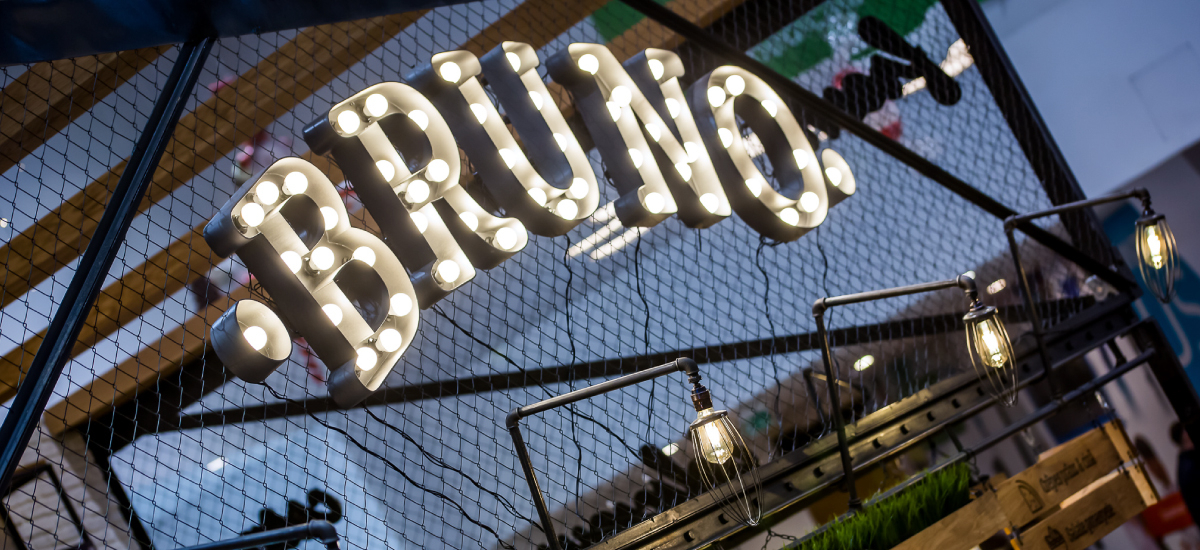

Work / Bruno
Brand Strategy and Brand Design for the most ambitious crêpes restaurant in Romania.
Challenge
Bruno was a risky bet on the local restaurant market. innerpride was asked to create a brand starting from a location infused with a strong personality resembling vintage New York restaurants. The main challenge was redefining the main dish, the crepe, seen in Romania as a dessert and moving it into the main course category.
We also had to take a relatively simple dish and turn it into something special, to change the outlook on what a crepe is and what can become using top quality ingredients and daring recipes.
Solution
Using typography and vintage textures we created a visual language that complemented the architecture. The chosen colors: yellow, brown and black were derived from traditional textures such as cast iron, wood and craft paper. The symbol is a smart morphing between the letter “B” and the triangular shape of a crepe.
The typography is bold and plays an essential role in the economy of the brand visual. A modern slab serif font was chosen to bring back that mid-century New York vibe.
Everything, from the menu, the aprons, the signage and the table coasters was designed to create a homogenous look & feel.
Result
Soon after launch, Bruno became the new sensation of the food-court challenging everything we knew about crepes. With fresh ingredients and delicious recipes, it managed to create a loyal and growing client base. The local success set the premises for national expansion, a natural next step for a growing brand.
At the end of the day, it’s all about what we can do for you and your company.
We’re not only a very capable team, we’re also good people.
Offices / Headquarters
Colonel Langa 17, Iași, Romania