Work / BlueAir
Respect goes a long way
From cold planes to warm people
Challenge
Blue Air was Romania’s largest airline in terms of passengers in 2019 but they weren’t getting credit from customers for all that they were doing. Their start as a small hand of passionate people and their commitment to service and customers wasn’t reflected in their visual identity. The livery was outdated and different from plane to plane this adding to the feel of “old planes” the customer had when boarding with.
inner*pride was tasked with ushering the Blue Air brand in a new era of growth by discovering it's unique potential and establishing a platform for growth.
Blue Air was a project born out of our relentless believe in Romanian entrepreneurs and their vision. For us it was more than a project, it was our contribution to something we perceived as a mission and we planned each step with care and responsibility transcending the field of aviation looking at a broader picture.
George Nisioiu, founder & partner, innerpride
Solution
We started by finding the essence of the brand, what it stands for! First, we conducted in depth interviews with almost 100 employees, stakeholders, partners, and 100 passengers to discover what makes BlueAir unique. One idea surfaced again and again – respect. Respect for the customer, respect for the profession, respect for the steel bird that does the heavy lifting. Following an extended audit stage innerpride developed a brand positioning meant to serve as the spine of a new brand philosophy for Blue Air – Respect goes a long way.
At the heart of the new visual language is Taifin, a distinct and ownable typeface. The typeface is designed for Latin & Greek scripts and comes in two different weights. Born out of our passion for typefaces and a strategic need - Tailfin is the first custom typeface for a low-cost carrier in Europe.
With more than 1000 word-mark explorations, innerpride has taken into account every issue that could possible affect the visual impact of the letters. The chosen typeface was a specially drawn variant of the custom typeface Tailfin - contributing thus to the cohesiveness of the brand.
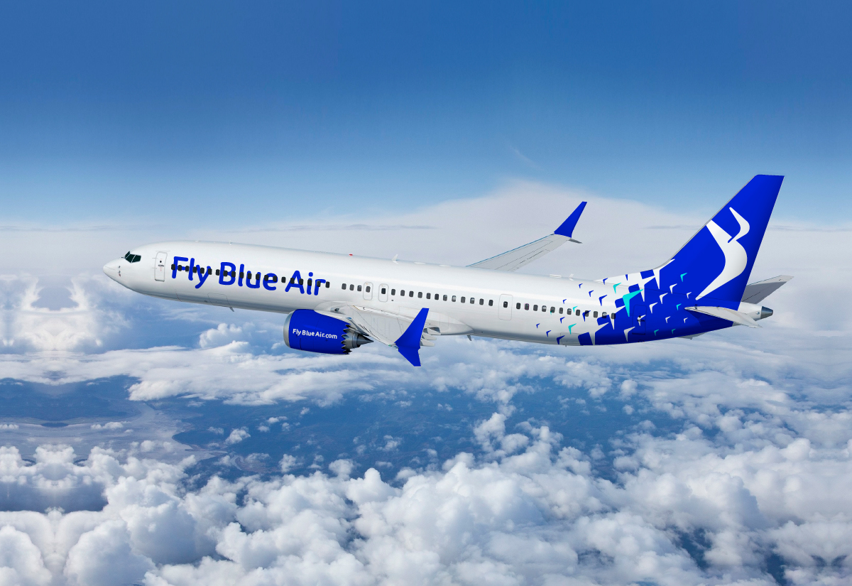
The new identity needed to embody motion, transitioning from the prior dusty blue to an electric blue which signaled a new direction for the brand. The symbol evolved from an outdated “go to” concept to a modern and minimalist monogram expressing movement and flexibility.
Result
Airline branding starts with the livery design, this is the most important touch-point of the whole brand ecosystem. With this in mind, our design team explored over 50 different livery design options. Besides the visual component of the livery design the team had to consider the technical and financial component - the costs of a single plane being painted can go as high as 300.000£.
Building upon the powerful idea of respect, we developed a new logo, livery, visual style, tone of voice and environments that bring to life an experience that is clear and confident, yet welcoming and engaging. The updated look and feel honors the airline’s heritage while capturing the timeless spirit of modern Europe.
Following the rebrand process Blue Air was transformed from cold planes to warm people; from being a provider of transportation to a participant on their customers’ journeys; and from offering a network of destinations to offering a world of possibilities – all of this with respect and genuine passion for flying.
Services involved
At the end of the day, it’s all about what we can do for you and your company.
We’re not only a very capable team, we’re also good people.
Offices / Headquarters
Colonel Langa 17, Iași, Romania