Work / Addiction.com
Inspiring the uninspired through knowledge
Online branding for world's leading portal of addiction recovery resources.
Challenge
In a world where if you’re not dealing with addiction yourself you probably know someone who is, addiction.com was created
to serve the addict and everyone who wants to help him, as well as clinicians and other health care professionals who care for
those dealing with addiction. Addiction.com aims to be the leading online destination for the most current, accurate and
evidence-based information about addiction, recovery and mental health.
Addiction.com is owned and operated by EBH, a leading provider of treatment for addiction and mental health issues.
How to create a brand that would break through in a saturated market?
Solution
We put ourselves in place of someone who is looking information about addiction and recovery. What would he do, where would he go? The best solution is sometimes the most obvious one: he would search online. Once you start typing, the online search engine gives you suggestions of what you might want to search for. These suggestions start form the default or from most searched terms to more sophisticated syntaxes.
Since addiction.com is to be the default web location for addiction related resources it is but obvious that once you start typing “addic…” the search engine suggests you “addiction” and once you hit “enter” the first result of the search to be addiction.com.
Working for leaders is challenging but the rewards are up to it.
- George Nisioiu, founder & partner, innerpride
Result
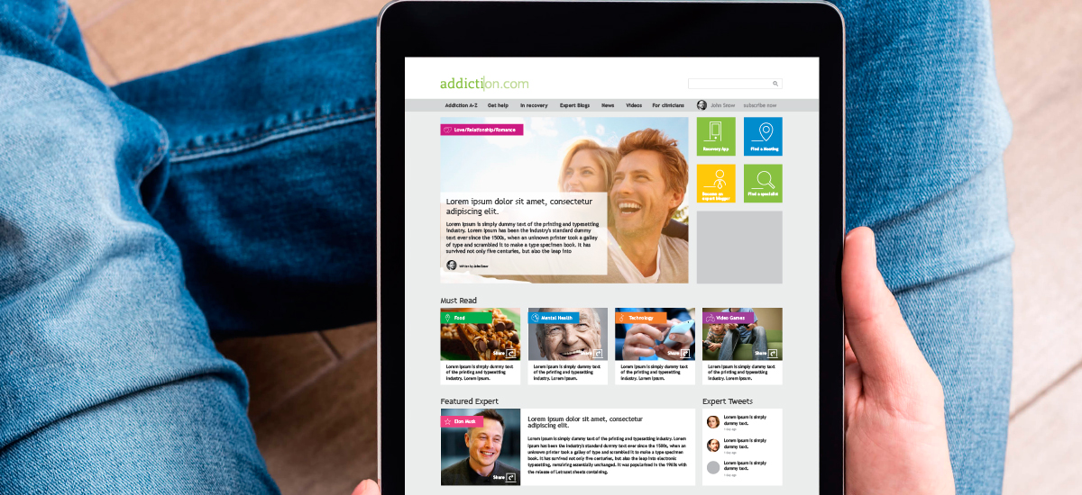
The tagline we developed, Stop searching. Start recovering, encompasses the brand purpose: stop searching, addiction.com is the most relevant website for dealing with addiction issues. Now that you’ve found it, start acting.
Starting from the premises that addiction.com is the default suggestion of the search engine, we developed a logotype that would say this in a subtle yet unequivocally manner. The combination of slab serif type – a reminder of the mechanical typewriter letter forms and a sharp sans serif, along with the separating cursor tells the brand story in a minimal yet powerful way. Following the logotype, we created a whole graphic language by using two typefaces – a slab and serif which are to be used in writing the headlines and branded messages. In addition we developed an extensive icons library to capture the diverse universe of the rehabilitation process.
Services involved
At the end of the day, it’s all about what we can do for you and your company.
We’re not only a very capable team, we’re also good people.
Offices / Headquarters
Colonel Langa 17, Iași, Romania