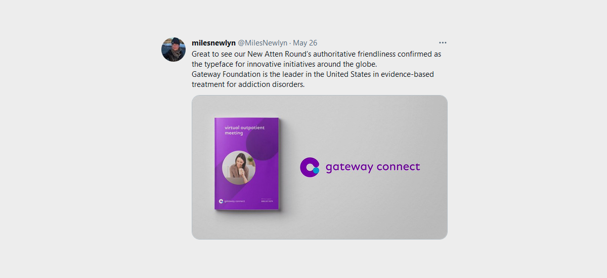
Gateway Foundation is the leader in evidence-based treatment for addiction disorders in the United States. As part of their forward thinking strategy, they developed a revolutionary new method of outpatient treatment via a telehealth app called Gateway Connect.
inner*pride was commissioned to develop a brand identity and a digital visual language capable of communicating the technical innovation as well as the social interaction paradigm it means.
We’ve placed an emphasis on two important visual elements: color and type. The new color scheme is bold and memorable but the type is the true hero here.
We’ve chosen New Atten Round, a new and fresh typeface developed by our long time friend and design hero Miles Newly. For making the type the true hero of the identity, Miles has been kind enough to make a few custom fine tunes in order to have a visual coherence between the communication typeface and the lettering of the wordmark.
More about this project in our upcoming study-case.
