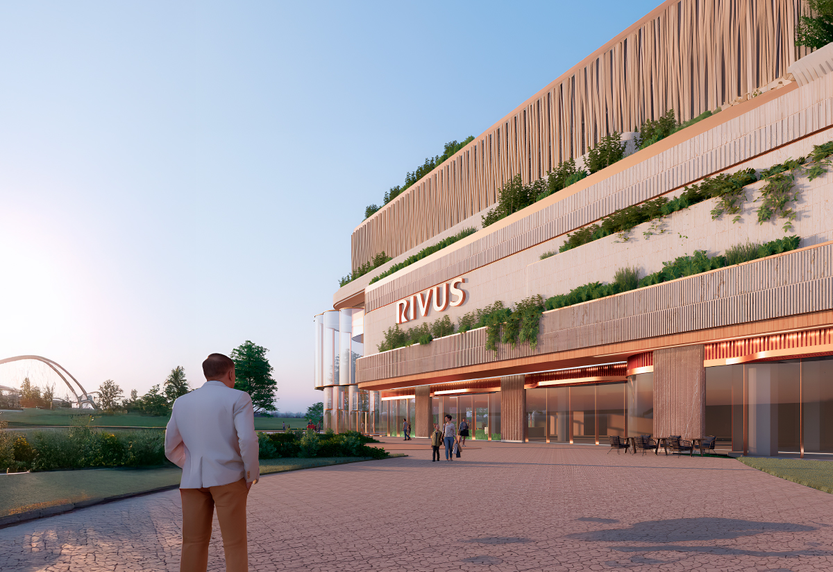
IULIUS, Romania’s largest developer of mixed-use projects, is bringing its most ambitious endeavour yet to Transylvania. RIVUS is set to reimagine what a vibrant, cosmopolitan city destination should look—and, more importantly, feel like.
inner*pride was brought on to translate that vision into a full identity system: one that would blend symbiotically with the architecture and become an emblem for what is set to become the beating heart of Cluj.
The symbol at the heart of RIVUS
The visual language starts with a symbol that merges two elements — the meandering river and the letter R — into a memorable, versatile mark. The logotype built alongside it is classical at its core, with just enough personality to stand on its own. Logotype and symbol were designed to work independently or together, giving the identity real flexibility across every touchpoint.
Beyond the primary symbol, the team developed a family of sub-symbols for each component of the project — office, live, arts, mall — and worked closely with the architects to bring the visual language into the architecture itself, shaping iconography and signage hierarchy at the scale the project demands.
Together with the IULIUS team, inner*pride also built the layouts and graphic principles behind RIVUS’ visual communication, laying the foundation for a premium, community-centred identity from day one.
“What a privilege to redefine, once again, Romania’s place branding scene. The same curiosity, the same eagerness to explore, and the amazement of discovering that solution you know is the right one. A great team and great partners are prone to result in greatness.”
— Viorel Nedelcu, creative director & partner, innerpride
RIVUS is already earning strong reviews from the community and industry alike — slowly becoming what it was always meant to be: a part of Cluj. And there’s a lot more still to unpack, from identity to environmental graphics, as the project comes to life.