Work / ANA ARE
Naivety, done with precision
Brand Strategy & Packaging Design for Romania's leader in pure juices
Challenge
ANA ARE had built its reputation the honest way — through real fruit, clean processes, and a genuine commitment to preserving flavour and nutrients the way nature intended. The product was good. The packaging was not. Lost on shelf, indistinguishable from a dozen competitors, the visual identity failed to communicate what made ANA ARE worth choosing.
inner*pride was brought in to close the gap: develop a positioning strategy and redesign the full packaging range so that the product on the outside finally matched the quality on the inside.
Solution
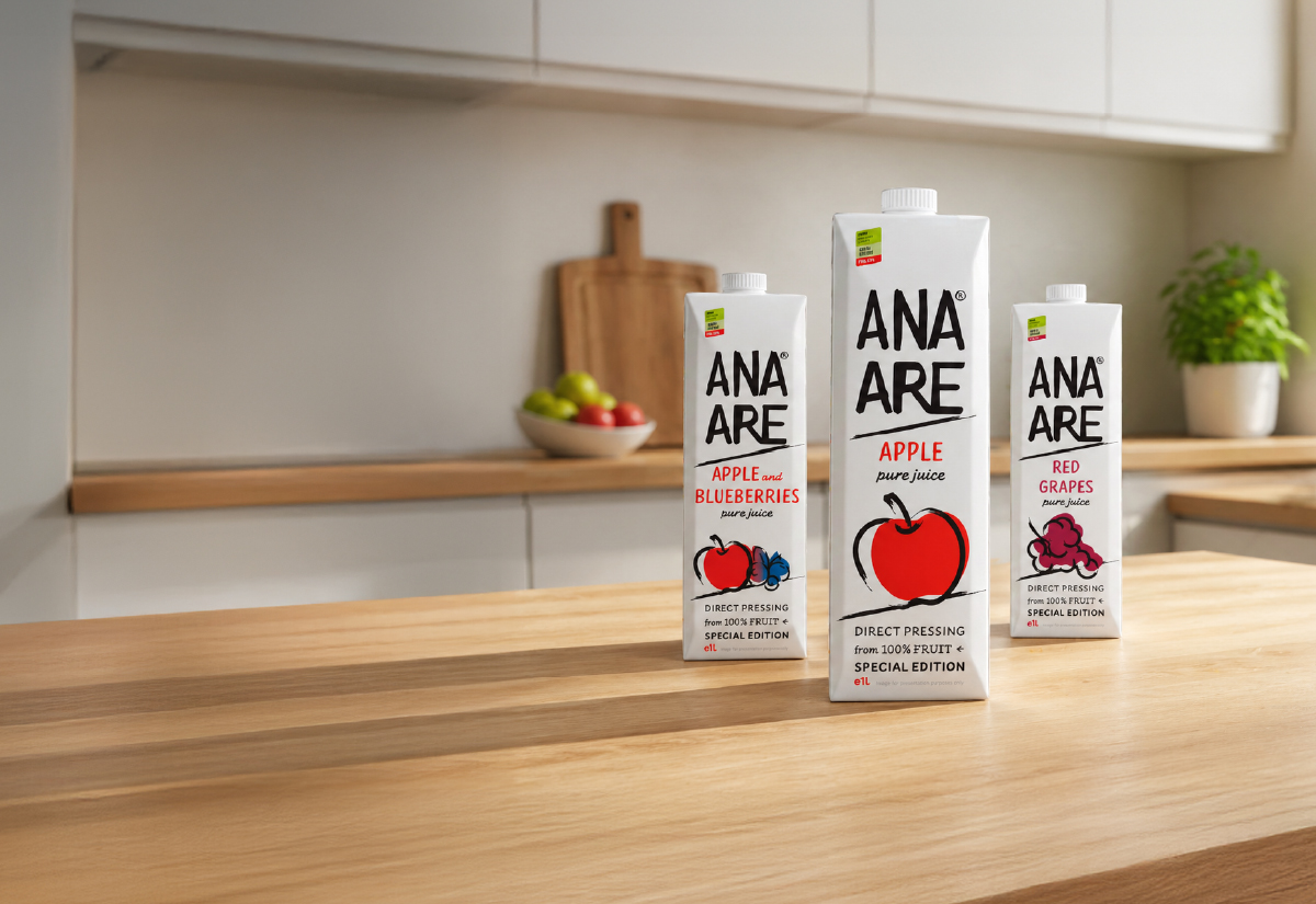
We started where the brand's truth was clearest — in its simplicity and warmth — and worked outward from there.
White became the anchor. In a category dominated by photography-heavy, colour-saturated packaging, restraint was the most radical move we could make. The white ground wasn't empty; it was editorial. It said nothing to hide.
The logotype was drawn with intention — bold, uppercase letters with the deliberate imperfection of a child's hand. Not naive by accident. Naive by conviction. It signals honesty at a glance and sets ANA ARE apart from every brand trying to look premium through complexity.
Fruit illustration followed the same logic. We stylised each fruit into flat, characterful forms — warm, tactile, unmistakably hand-made. No stock photography. No hyper-realism. The illustrations feel like they belong to a world where things are made with care.
The mascot, ANA herself, was the most demanding part of the work. We needed to give her a personality that was playful without being childish, charming without being generic. Over 200 sketches were drawn before she found her voice. The result is a character with genuine expression — curious, joyful, a little mischievous.
The full range — 1L, 2L, 3L — was redesigned within this new system. The 200ml format received its own strategic treatment: a composition where ANA takes centre stage, speaking directly to children as the primary audience and their parents as the decision-makers. Same brand world, different hierarchy.
Result
Sales nearly doubled within the first year of launch.
ANA ARE is now visible on shelf — not just present. The brand has a personality that consumers recognise and return to. The portfolio continues to grow, supported by a visual system built to scale.
Sometimes the right design doesn't shout. It just becomes impossible to ignore.
Services involved
At the end of the day, it’s all about what we can do for you and your company.
We’re not only a very capable team, we’re also good people.
Offices / Headquarters
Colonel Langa 17, Iași, Romania